Type: Interactive Web Map / Flow Map
This interactive map is for exploring the temporal and spatial trends of flight delays within the U.S. from 2014 to 2016 using data collected from the U.S. DOT. We believe that users will learn to make smarter itinerary decisions through comparing the historic differences in delay frequencies between airlines.
Tools Used: HTML / CSS, JavaScript / jQuery, D3, jRange
Please click the first image below to experience the interactivity!
* This map has been awarded:
• The Second Place for Barbara Bartz Petchenik Memorial Award in Cartographic Design, UW-Madison
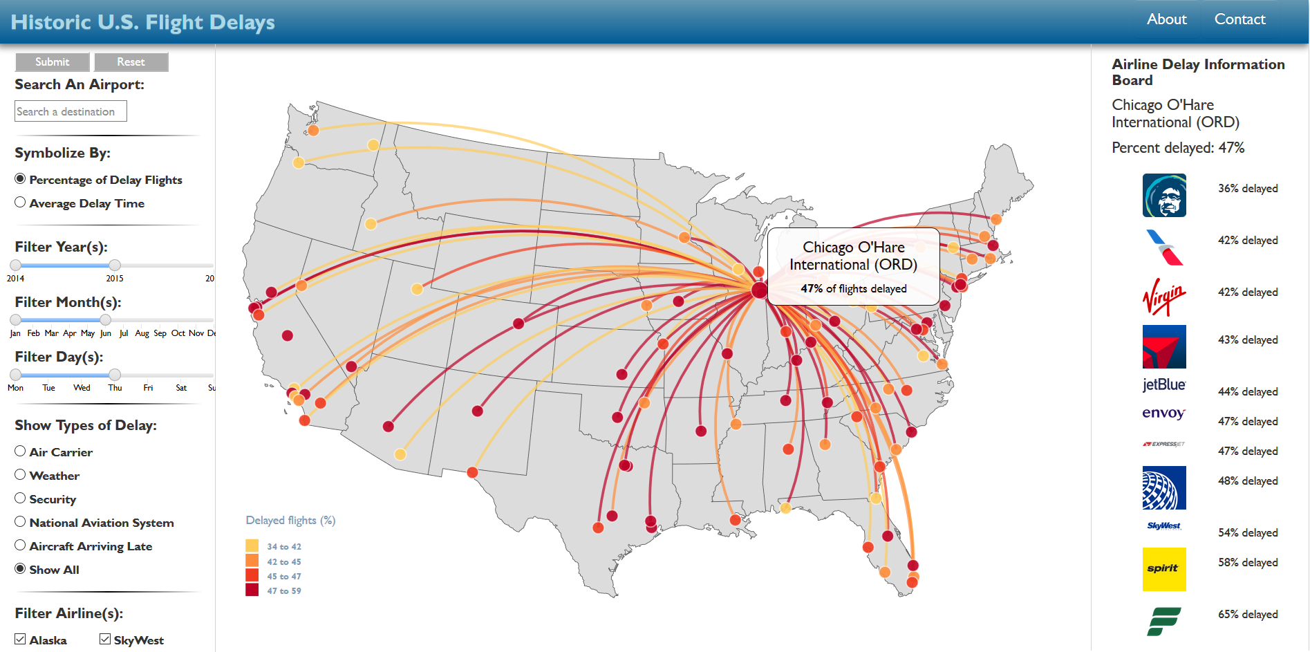
Figure1: The beta version of the user interface ↑.
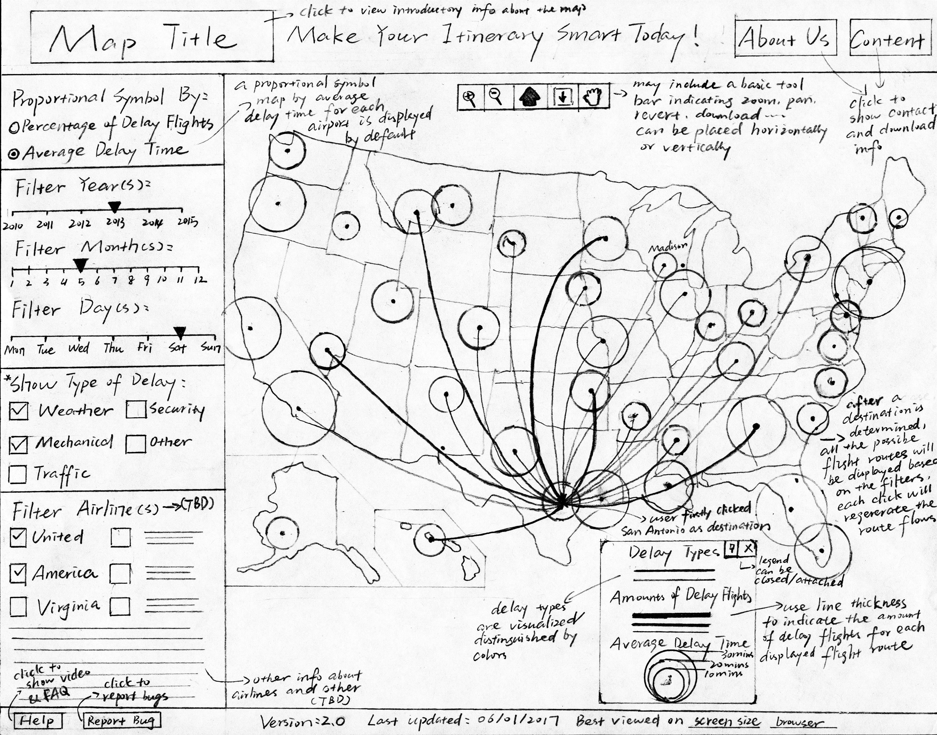
Figure2: Hi-fi (high-fidelity) wireframe design for the user interface ↑.