Type: Choropleth Map / Infographic
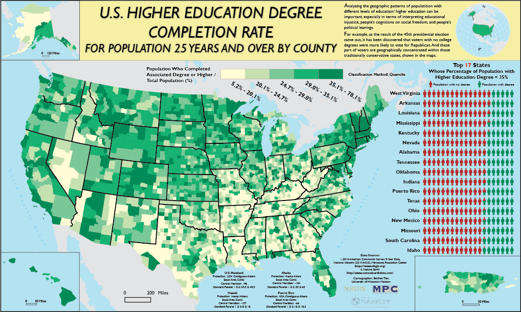
For completing this map, I calculated the percentage of population who completed associated degree or higher for each counties in the U.S.
I then applied sequential color ramp and quantile classification method to visualize the relevant geographic pattern.
One interesting phenomenon I discovered from this map is that lots of traditionally conservative states in the southern U.S. have lower education completion rates than the northern part of the nation.
Can one's educational level be related with his/ her political motivation?
Tools Used: ArcGIS, Adobe Illustrator CC